Obviously our main focus is on the actual product namely our modernised etch a sketch but in order to bring it to the market we have to have a way of packaging it, at the very least have a logo to go with it.
Since we haven’t entirely decided if we are only working towards an etch a sketch or if we want to have other ways of interacting with the product the logo will have to be suitable for any outcome.
Therefor I have had a look at old games (including the etch a sketch) and their logos for inspiration.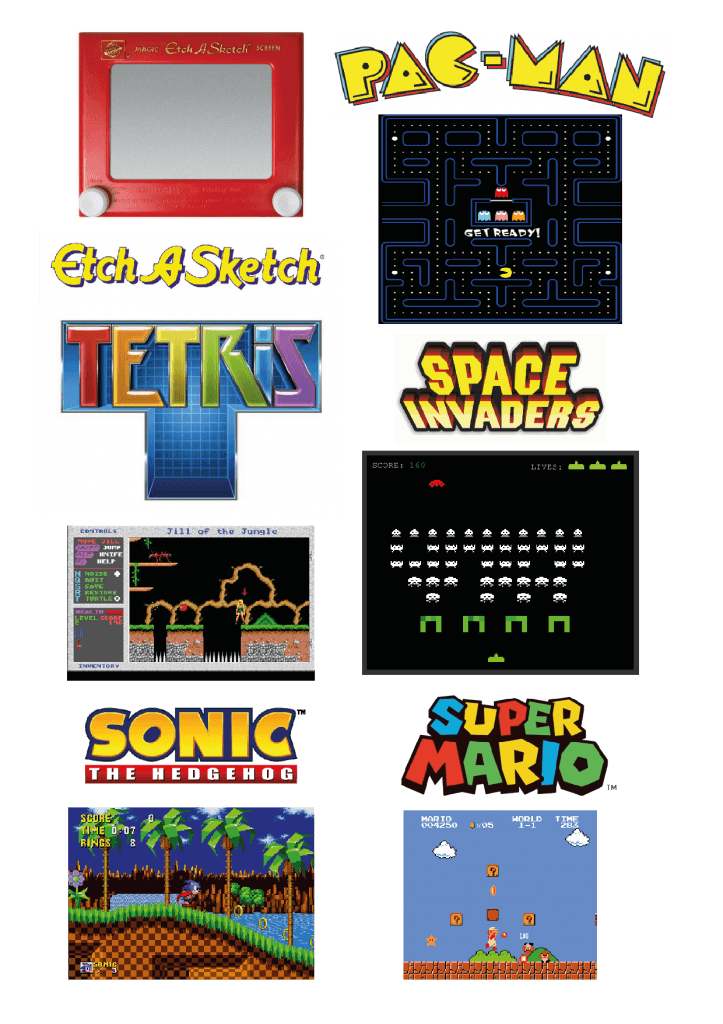
There is a definite tendency towards yellow concerning the logos. Whilst the fonts are quite funky the actual games are kept quite simple regarding the visual, yet making them very colourful. The simplicity has obviously to do with the performance of graphic cards from around that time.
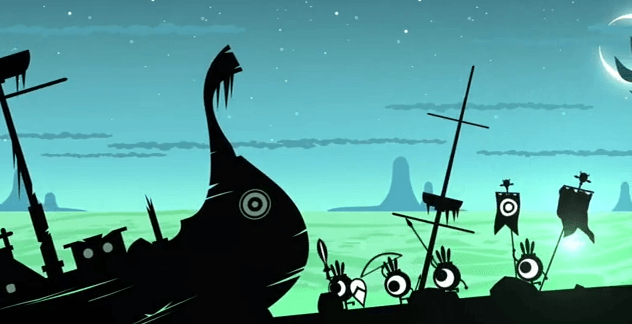
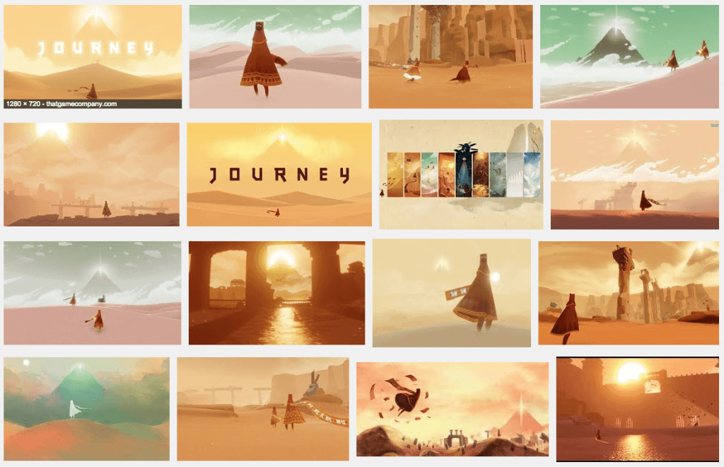
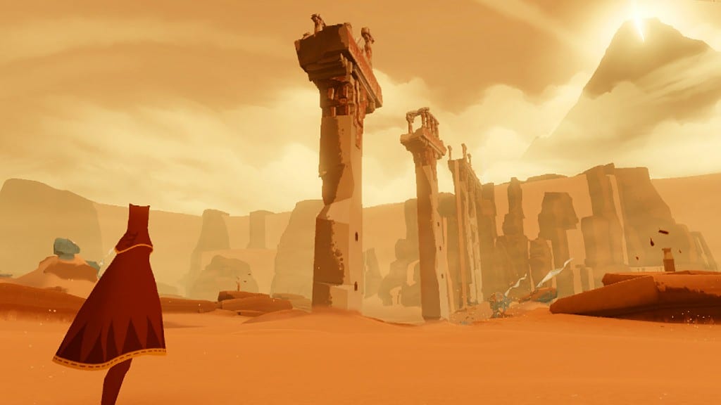
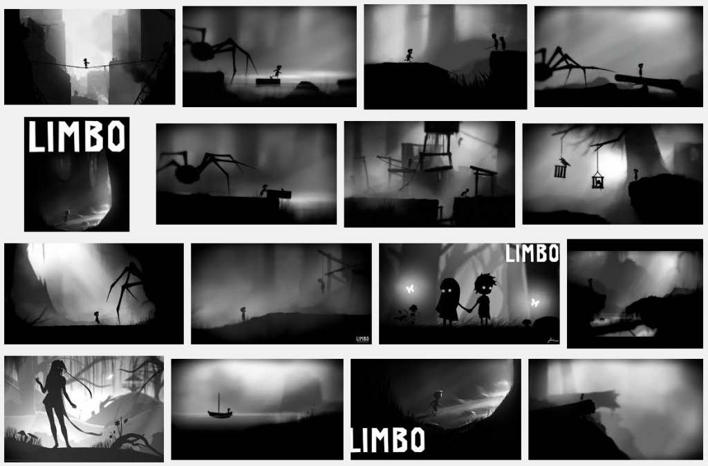
I also looked at newer games such as Journey, Limbo and Patapon. all of these games have a very strong yet simple visual aspect to them. Considering we are modernising an old game this might be the style to go for.
Limbo
Patapon
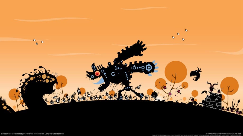
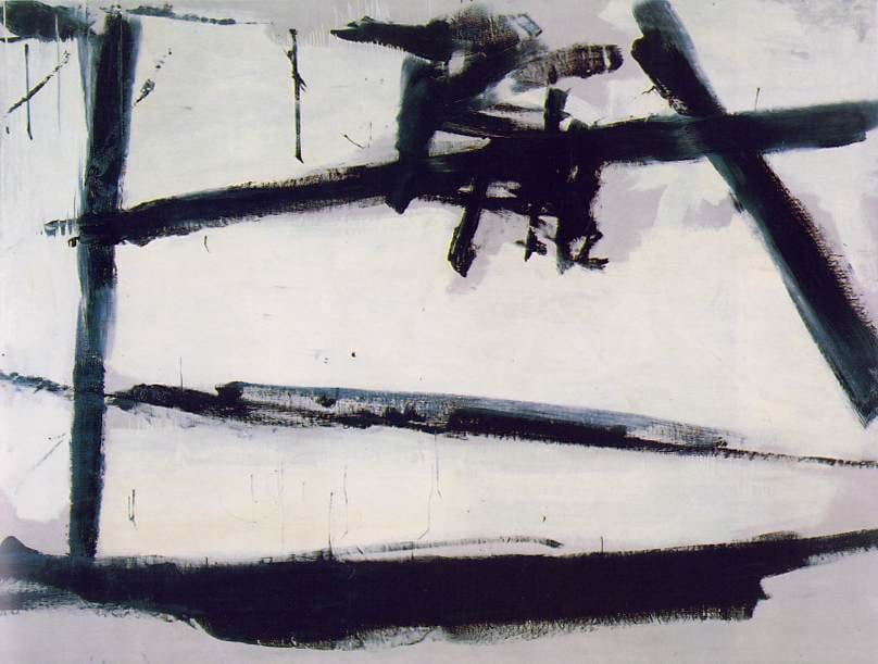
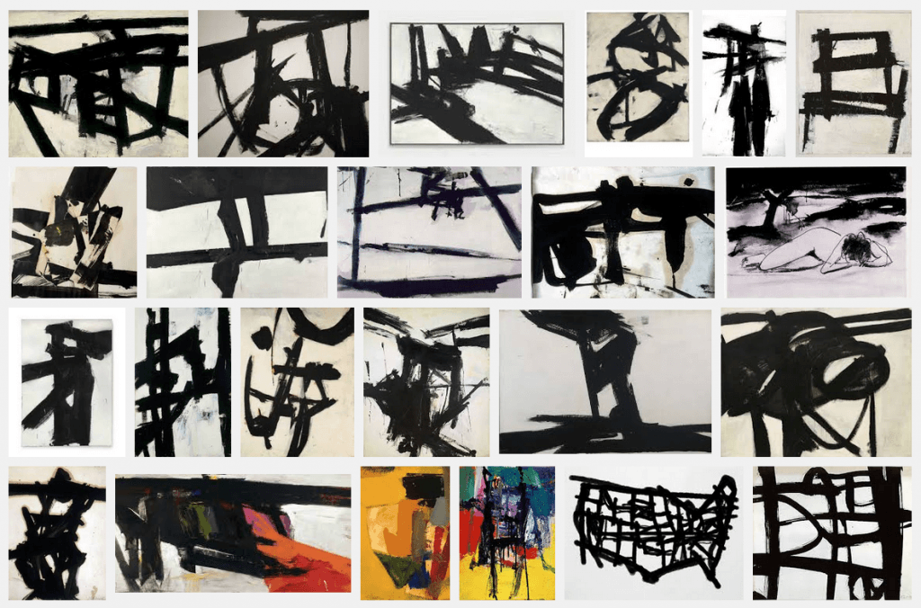
Because we are using black electronic paint, the logo will have to work in black and white to fit our style. Whilst using the paint we saw similarities to Franz Kline’s work which again led us to look at asian calligraphy and art.




Recent Comments